December 11, 2017
For our final project, Caroline and I will be revising our font that we originally created for the Escape Room. While I found this to be the most challenging project I completed during this course, I still want to revisit our final design since I have improved my skills with different programs (specially Adobe Illustrator, as I like to think I can at least lasso and create a vector at this point, which is much better than where I started).
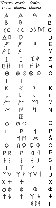
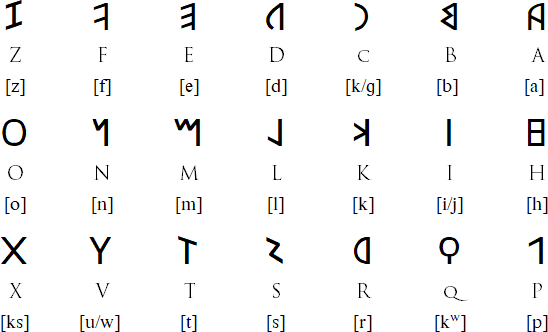
After seeing everyone's final designs, our font really stuck out to me. We didn't modify an existing font and we didn't incorporate any "cold" elements, such as icicles, fur, or ice picks into our font. Something that Jennifer wrote in our feedback was that our font resembled more of the Roman alphabet and lacked resemblance to the Nepali language, which was our original plan. I decided to look up a few ancient alphabets, since I am unfamiliar with their looks.
Phoenician Alphabet

Source: https://en.wikipedia.org/wiki/Phoenician_alphabet
In the Phoenician alphabet, the letters for ', B, W, Z, K, R, S, and T really stuck out to me as modestly resembling our font, which I will again include here for reference:

Source: https://en.wikipedia.org/wiki/Old_Italic_script
Again, this alphabet is made of similar lines and sharp angles as our Rune font is.
Latin/Roman Alphabet
Source: https://www.omniglot.com/writing/latin.htm
Something else that was confusing about our font was how we settled on runes, since we did not look up any of these alphabets prior. Caroline and I both were not happy with our original fonts, so we decided to start from scratch. The whole inspiration for this font came from the letter R, which I had just happened to doodle on a piece of paper. From this letter came this:
 We based the rest of our alphabet off this style, which was when we decided that it seemed to resemble runes and cave drawings.
Something else Jennifer commented on our feedback was that she really liked the letters E and H. Caroline and I loved the letter z (unfortunately, a very unused letter), but the letter E was a close second. She recommended that we repeat the upward balance these letters had on some of the other letters, such as the letters Y, T, or I. We had also mentioned in our artists statement that we felt that our font had a hand drawn feel. Jennifer also recommended that if we wanted for this to come across that our letters needed to be more fragmented. Caroline and I will be meeting within the next few days to fix our design.
For our final project, Caroline and I will be revising our font that we originally created for the Escape Room. While I found this to be the most challenging project I completed during this course, I still want to revisit our final design since I have improved my skills with different programs (specially Adobe Illustrator, as I like to think I can at least lasso and create a vector at this point, which is much better than where I started).
After seeing everyone's final designs, our font really stuck out to me. We didn't modify an existing font and we didn't incorporate any "cold" elements, such as icicles, fur, or ice picks into our font. Something that Jennifer wrote in our feedback was that our font resembled more of the Roman alphabet and lacked resemblance to the Nepali language, which was our original plan. I decided to look up a few ancient alphabets, since I am unfamiliar with their looks.
Phoenician Alphabet
Source: https://en.wikipedia.org/wiki/Phoenician_alphabet
In the Phoenician alphabet, the letters for ', B, W, Z, K, R, S, and T really stuck out to me as modestly resembling our font, which I will again include here for reference:

Old Italic Script
Source: https://en.wikipedia.org/wiki/Old_Italic_script
Again, this alphabet is made of similar lines and sharp angles as our Rune font is.
Latin/Roman Alphabet
Source: https://www.omniglot.com/writing/latin.htm
Something else that was confusing about our font was how we settled on runes, since we did not look up any of these alphabets prior. Caroline and I both were not happy with our original fonts, so we decided to start from scratch. The whole inspiration for this font came from the letter R, which I had just happened to doodle on a piece of paper. From this letter came this:

Something else Jennifer commented on our feedback was that she really liked the letters E and H. Caroline and I loved the letter z (unfortunately, a very unused letter), but the letter E was a close second. She recommended that we repeat the upward balance these letters had on some of the other letters, such as the letters Y, T, or I. We had also mentioned in our artists statement that we felt that our font had a hand drawn feel. Jennifer also recommended that if we wanted for this to come across that our letters needed to be more fragmented. Caroline and I will be meeting within the next few days to fix our design.
I really like how took an objective look at your font to evaluate its strengths and weaknesses to best decide how to move forward. I like the idea of fragmenting your letter a lot. I feel that this will give it an aged appearance that will promote the theme of the escape room. Right now, your font looks a little too perfect to be hand drawn and I really think that fragmenting the letters and adding some seemingly random variation will make them seem weathered. This would be right in line with the theme of the escape room as the wind and snow does some damage to mountains and the people who scale them. Encouraging spontaneity through fragmenting and non-uniform variation will also encourage the crazy "anything can happen" type feel that an escape room's title should convey.
ReplyDeleteI really liked your comment on the letter fragmenting would give the font an aged appearance. It's definitely something Caroline and I hadn't thought about. Our final design reads are more "clean cut", but if we were to revisit this font again, fading the color or the edges could give it that aged look.
DeleteI think we both have a fresh, new perspective on this project after getting our feedback from Professor DeWinter. We have a lot of work to do, but I think that getting those sharp edges and corners in will really get it to look like a hand-carved sign, and the serifs will look more like the serifs in the Mount Everest base camp sign. I'm excited to work with you again YAY!
ReplyDelete