November 14, 2017
Infographic
For my next visual rhetoric project, I will be working with Natasha and Caroline to create an infographic about a WPI club or organization.
An infographic should:
To begin our design process, we googled infographics for inspiration.
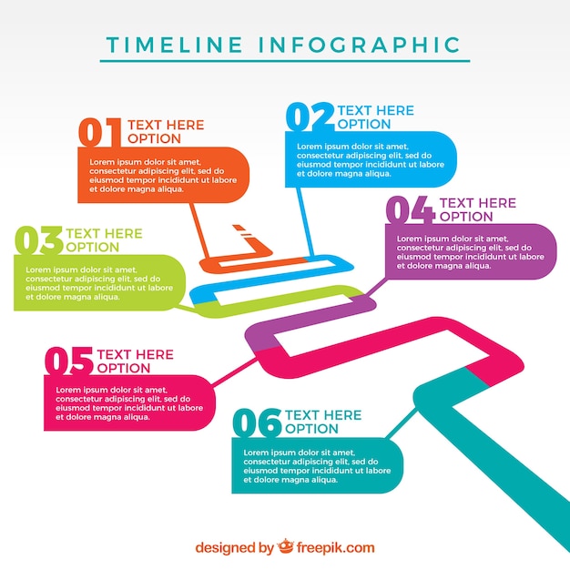
Source: https://www.freepik.com/free-vector/infographic-template-design_1130959.htm

Source: https://www.pinterest.com/tiffsburger/burger-infographics/?lp=true

Source: http://thefinishedbox.com/inspiration/web-interfaces/10-fantastic-money-and-finance-infographic-designs/
Source: http://mrsnovotnyart.weebly.com/alternative-yearbookinfographic-project.html

Source: http://www.kytheram.com/blog/infographic-examples/

Source: https://www.columnfivemedia.com/9-infographic-design-examples-that-will-leave-you-inspired
Brainstorming
Club ideas:
Infographic
For my next visual rhetoric project, I will be working with Natasha and Caroline to create an infographic about a WPI club or organization.
An infographic should:
- Use pictures, colors, and fonts to tell a story
- Include statistics, only if relevant and contribute to the overall information and story that is trying to be convey
- Include a central image to tell the story
- NOT be a bunch of semi-related pictures that appears to give information in a way to catch someone's eye but does not have a solid central theme
To begin our design process, we googled infographics for inspiration.
Source: https://www.freepik.com/free-vector/infographic-template-design_1130959.htm
Source: https://www.pinterest.com/tiffsburger/burger-infographics/?lp=true
Source: http://thefinishedbox.com/inspiration/web-interfaces/10-fantastic-money-and-finance-infographic-designs/
Source: http://mrsnovotnyart.weebly.com/alternative-yearbookinfographic-project.html
Source: http://www.kytheram.com/blog/infographic-examples/
Source: https://www.columnfivemedia.com/9-infographic-design-examples-that-will-leave-you-inspired
Brainstorming
Club ideas:
- Cheese Club
- Gompei's Goat Cheese
- Crimson Key
- Pep Band
- LARPING club
- Greek organizations
Final idea: WPI EMS Club
Caroline, Natasha, and I decided to pursue creating an infographic about the WPI EMS club. It is not talked about very much at WPI, but is a very important organization on our campus as they are a team of first responders to medical emergencies. The students in this club work in shifts as there is always someone on call 24/7.
Picture ideas:
- Generate a word cloud in the shape of a heart, ambulance, first aid sign, or anything medical related.
- Words can come from WPI EMS website or polls asking people what they think of when they think of EMS.
- Central picture of an ambulance driving and sub-pictures are medical tools in the ambulance with different statistics that relate to the tools.
- Ambulance driving along the road - road to become a WPI EMS
I love how you are not focusing specifically on statistics but on qualitative survey data. I think, considering what statistical information is easily accessible on this topic (probably not much) and your purpose of spreading awareness and appreciation for this club/enticing individuals to join, this would be the most effective way to convey such information. I also really like the info-graphics you found as background information. They are defiantly on the more effective type of info-graphic as Proffessor Dewinter discussed in class. They offer an impressive amount of inspiration for design factors that we'll have to consider later such as color pallet, font choice, and spatial organization. I am really interested to see which direction you take this info-graphic!
ReplyDeleteI love the infographic examples you've collected here! I Googled infographics for a little bit while brainstorming with my team, but I never found ones that were very inspiring; I particularly enjoy the simple yet informative design of the sinking ships.
ReplyDeleteWith that said, your final design ideas don't immediately seem to reflect the kinds of examples you posted here - particularly the word clouds! One thing you see a lot on blogs (including ones like this one) are things called "Tag Clouds", which are word clouds of all of the tags on a given website. However! One interesting twist that most tag clouds introduce is the idea of making individual tags in the cloud larger based on their frequency; maybe you could use this in combination with some statistics to give two dimensions of information to your word cloud ideas?
I am glad that you decided to make an infographic on WPI EMS. I only recently found out that it is a thing, so I completely agree with your point that "It is not talked about very much at WPI." I think it is really cool that students are entrusted with a job of such great responsibility. The WPI EMS club deserves more publicity, and your infographic will be a step towards that.
ReplyDeleteHaving your infographic describe the process of becoming a WPI EMS member seems like a solid idea. Most people have no idea of that process and may be more likely to join WPI EMS if the process of joining is laid out for them and seems simple.
A word cloud is such a great idea! I might use one in my group's infographic now.
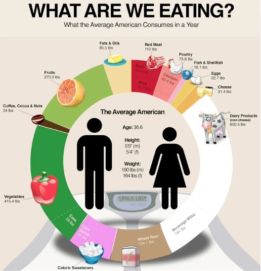
LIT group! ;) I really really love your infographic examples. These are really awesome, effective infographics! I think the most fascinating infographic was the percentages of the amount of food that americans eat each year. I can't believe how many dairy products the average american consumes! AND they had to separate out cheese from that section! This is a really really effective argument for the dominance of the dairy industry in the US, an industry that has been discussed on multiple forums and is the reason for a lot of people in the US going vegan. I think that it tells quite the story without really forcing their argument down the viewer's throat.
ReplyDelete