November 8, 2017

Font Design

Overall theme: disaster, menacing, caution, trip gone wrong

For font design inspirations, I began by searching for images related to some of the key words from my previous blog post.

Disney's Expedition Everest:
Image result for expedition everest sign
Source: http://www.wdwlive.com/picture/animal-kingdom/asia/expedition-everest-2085-9.html

Image result for expedition everest sign
Source: http://www.onlywdworld.com/2012/02/disney-world-rides-expedition-everest.html

Snow/cold/glacier fonts:
Image result for glacier font
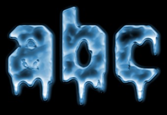
Source: http://www.picturetopeople.org/text_generator/others/ice/frozen-text-logo-generator.html

Image result for snow font
Source: http://www.fontspace.com/aarrgghh/ice-and-snow

Nepali written language:

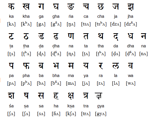
Source: https://en.wikipedia.org/wiki/Nepali_language#/media/File:Nepali_Language.gif


Conclusions/Further Ideas:

  • Serif font with letters that come to points at the end to give them a glacial quality
  • Letters should be curved, not block letters
  • "Escape" and "Yeti Expedition" should have more spacing between letters than the words "from the"
  • Based off Nepali written language, almost like calligraphy, with thicker down strokes and thinner upwards and curved strokes
  • Final line could have more dripping icicles off of the letters
Playing Around with Fonts


Comments

  1. You did a great job of looking through a variety of thematically related fonts and picking out key, distinct features from each to incorporate into your own. I'm particularly curious how you will try to incorporate the calligraphy-like details. I also appreciate how you started thinking very specifically about the final layout your font will be used in before you even started drawing it.

    ReplyDelete

Post a Comment

Popular posts from this blog

November 17, 2017 Revising our Vision My infographic group met again today to discuss further changes that we wanted to make to our draft. During class, we realized that we did not have a strong audience that we were trying to target with our infographic. After some reflection and interviewing members of WPI EMT, we have decide to target pre-med majors at WPI as well as students who hope to become EMTs after graduation, since EMS experience gives you training to become an EMT. We decided to title our infographic "Road to WPI EMS" as we will be highlighting the steps that need to be taken to be a member of WPI EMS. Our central image will still be the ambulance but it will also include a winding road that it will be traveling on. Road signs will accompany the road to give direction to how to apply and join WPI EMS. We are still planning to include medical equipment in the final infographic. Here is our second draft: We used the signs on the road for the reader to
November 14, 2017 Infographic For my next visual rhetoric project, I will be working with  Natasha  and  Caroline  to create an infographic about a WPI club or organization. An infographic should: Use pictures, colors, and fonts to tell a story Include statistics, only if relevant and contribute to the overall information and story that is trying to be convey Include a central image to tell the story NOT be a bunch of semi-related pictures that appears to give information in a way to catch someone's eye but does not have a solid central theme To begin our design process, we googled infographics for inspiration. Source:  https://www.freepik.com/free-vector/infographic-template-design_1130959.htm Source:  https://www.pinterest.com/tiffsburger/burger-infographics/?lp=true Source: http://thefinishedbox.com/inspiration/web-interfaces/10-fantastic-money-and-finance-infographic-designs/ Source:  http://mrsnovotnyart.weebly.com/alternative-yearbookinfographic-pro
November 15, 2017 First Draft Since EMS does not have an official club symbol, we decided to use an ambulance as the central picture to our infographic story. In high school, I used a word grouping program that tracked the frequency of the appearance of words and organized them into a set picture. We decided to use a similar program to group important words we found on the EMS website into the shape of an ambulance. Our original idea was to depict an ambulance traveling along a road to the hospital with puffs of white and grey smoke trailing behind. EMS refers to it's members as dark smoke and white smoke - the dark smoke being those that happen to receive a lot of calls and the white smoke those that rarely receive calls. After trying to create a few rough drafts, we decided to try a new approach. We were able to speak to a few members of WPI's EMS to gather some general information and their opinions about the club. They were super friendly and so willing to he