November 7, 2017
Fonts and their influences are everywhere.
Like breathing, reading has almost become an instinct. There are words everywhere - from road signs, to social media, to the nutrition facts on a Crispix Cereal box. When I am presented with something with words on them, I read it. With those words comes their fonts. As reading has become an instinct, I have never considered how the fonts the words are written in influence my understanding and perception of a sign, a video game, or a book.
Fonts can:
Escape from the Yeti Expedition Font
Assignment: to design a font for an Escape from the Yeti Expedition escape room.
The Yeti (The Abominable Snowman)
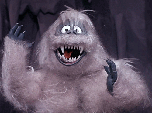
Honestly, I have never watched a scary movie. Halloween is not my favorite holiday. I hate being scared. So, when I first received this font assignment, the first thing that popped into my head was the Expedition Everest roller coaster in Animal Kingdom at Walt Disney World. I am a Disney fanatic and have experienced this roller coaster multiple times, but whenever we approach the cave with the Yeti in it, I never have my eyes open.

The scary yeti on Expedition Everest, obtained from:
https://www.orlandofuntickets.com/articles/top-animatronics-at-walt-disney-world/
In reality, it's too dark to even see the Yeti clearly. While I am terrified of this Yeti, Disney has not only portrayed the Yeti as a terrifying monster. In the classic film, Monsters Inc., his shadow and movements at first signal a monster, but as soon as he comes into focus, the Yeti is portrayed as a friend. I happen to like this Yeti more.
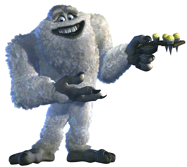
Monsters Inc. Pete Docter. Disney Pixar, 2001. Film.
Another popular Yeti is the one featured in the film Rudolph the Red Nosed Reindeer. Again, this is a friendly Yeti that strays from the scary myths of the real Yeti.
Rudolph the Red Nosed Reindeer. Kizo Nagashima and Larry Roemer. Videocraft International, Ltd., 1964. Film.
Sherpas
The Sherpa are the people who mainly live in the northeastern parts of Nepal, near Mt. Everest. They live in elevations from 8,000 to 12,000 feet in the Himalayas. They have a high respect for the mountains and try to protect their region from pollution from tourists. They are excellent mountain climbers and know the mountains well.
https://www.britannica.com/topic/Sherpa-people
There is a story called "The Annihilation of the Yeti" that tells the tales of Sherpas looking for revenge against the Yetis. They pretend to destroy each other in the hopes that the Yetis will see what they were doing and copy them, thus destroying their kind. Instead, the Yetis move higher into the mountains and declare revenge on the Sherpas.
http://www.bbc.com/earth/story/20150630-is-there-such-a-thing-as-a-yeti
The Himalayas
The mysterious region where the Yeti is said to dwell. They are considered to be one of the hardest, yet most attractive, set of mountains to climb. While tall and beautiful, they feature jagged peaks and spikes, posing a challenge.


From: https://www.britannica.com/place/Himalayas
Font ideas:
Fonts and their influences are everywhere.
Like breathing, reading has almost become an instinct. There are words everywhere - from road signs, to social media, to the nutrition facts on a Crispix Cereal box. When I am presented with something with words on them, I read it. With those words comes their fonts. As reading has become an instinct, I have never considered how the fonts the words are written in influence my understanding and perception of a sign, a video game, or a book.
Fonts can:
- Influence how we perceive and interpret any work, from books to signs.
- Help the author or artistic producer portray a theme.
The final version of my font will communicate the theme of the escape room to the reader.
Assignment: to design a font for an Escape from the Yeti Expedition escape room.
The Yeti (The Abominable Snowman)
Honestly, I have never watched a scary movie. Halloween is not my favorite holiday. I hate being scared. So, when I first received this font assignment, the first thing that popped into my head was the Expedition Everest roller coaster in Animal Kingdom at Walt Disney World. I am a Disney fanatic and have experienced this roller coaster multiple times, but whenever we approach the cave with the Yeti in it, I never have my eyes open.
The scary yeti on Expedition Everest, obtained from:
https://www.orlandofuntickets.com/articles/top-animatronics-at-walt-disney-world/
In reality, it's too dark to even see the Yeti clearly. While I am terrified of this Yeti, Disney has not only portrayed the Yeti as a terrifying monster. In the classic film, Monsters Inc., his shadow and movements at first signal a monster, but as soon as he comes into focus, the Yeti is portrayed as a friend. I happen to like this Yeti more.
Monsters Inc. Pete Docter. Disney Pixar, 2001. Film.
Another popular Yeti is the one featured in the film Rudolph the Red Nosed Reindeer. Again, this is a friendly Yeti that strays from the scary myths of the real Yeti.
Rudolph the Red Nosed Reindeer. Kizo Nagashima and Larry Roemer. Videocraft International, Ltd., 1964. Film.
Sherpas
The Sherpa are the people who mainly live in the northeastern parts of Nepal, near Mt. Everest. They live in elevations from 8,000 to 12,000 feet in the Himalayas. They have a high respect for the mountains and try to protect their region from pollution from tourists. They are excellent mountain climbers and know the mountains well.
https://www.britannica.com/topic/Sherpa-people
There is a story called "The Annihilation of the Yeti" that tells the tales of Sherpas looking for revenge against the Yetis. They pretend to destroy each other in the hopes that the Yetis will see what they were doing and copy them, thus destroying their kind. Instead, the Yetis move higher into the mountains and declare revenge on the Sherpas.
http://www.bbc.com/earth/story/20150630-is-there-such-a-thing-as-a-yeti
The Himalayas
The mysterious region where the Yeti is said to dwell. They are considered to be one of the hardest, yet most attractive, set of mountains to climb. While tall and beautiful, they feature jagged peaks and spikes, posing a challenge.
From: https://www.britannica.com/place/Himalayas
Font ideas:
- Words "Yeti Expedition":
- Displayed on a broken sign with claw marks from the Yeti, words could appear to have been carved into the wood.
- Word "Escape":
- Puffy, like clouds or oxygen
- On an oxygen tank
- Caution tape
- Pickax
- Backpack/survival pack
- Icicle-like font
- Words "from the"
- Smaller than other words
- Lowercase letters
- Caution tape fluttering in the wind and torn
- Background of a mountain
- Whole logo could be written into parts of a mountain
- Something to signal revenge, as the Yetis may be taking revenge on the expeditioners
Your research is really in depth! I love how you approached this project from looking the perspective you felt comfortable with even if it may not have been the scary side of things. I think that will really help your project stand out among the crowd. I think it will also help when it comes down to combining your ideas with your partners as you will probably be able to provide a unique sense of balance to the project.
ReplyDelete