November 10, 2017
Revenge of the Yeti - Collaborative Font
A client representative came to our lecture yesterday to answer questions about our fonts and the escape room. Some information we were given included:
Source: http://www.designbolts.com/2012/07/07/50-best-beautiful-elegant-free-fonts-to-download/
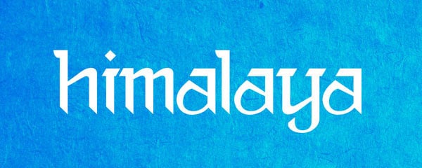
This font really appealed to me. I like how the downstrokes all comes to a point, signifying cold, possibly icicles, or something harsh. The rounded, and in come cases like the letter "a", pointed, upstrokes reminded me of the mountains. The contrast between the serif one the upper portion of the letters and sans serif at the bottom really sticks out. The color contrast of this image also brings to mind the blue sky and snowy mountain peaks.
Runes
Source: https://en.wikipedia.org/wiki/Runes

Source: http://www.fontscape.com/explore?2DNL
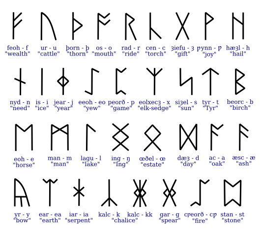
From the escape room logo that was provided to our class, we saw that the yeti was surrounded by jagged edges, possibly signaling a cave or ice formation, but clearly conveyed "cold". We wanted our font to match these jagged edges. With some research, we found the above rune fonts, with letters that come to points where there would normally be a round edge.
Some More Yetis
Source: http://cryptidz.wikia.com/wiki/File:Light_Coat_Yeti.jpg

Source: https://greatdivide.com/beers/yeti-imperial-stout/
New Direction
From further research and the information given to us from the sponsor, we have come up with a new concept for our font design.
Revenge of the Yeti - Collaborative Font
A client representative came to our lecture yesterday to answer questions about our fonts and the escape room. Some information we were given included:
- The name of the escape room will be "Revenge of the Yeti"
- The font will only be used as a title font, not as more traditional paragraph font or on clue cards.
- The escape room is made of two segments: first you must find the lost expedition, then you must escape the Yeti.
- If you can't escape the Yeti, then you are killed
- The keywords Sherpa and Himalaya were more just for brainstorming purposes, the room will not have a strong tie to the Himalayas, just to cold mountains. The Sherpas will be the mountain guides who help you through the Escape Room.
- The font will be a cold color, such as blue or purple
- Some scenery will include a bunker where you escape into, older radios, and cloth tents.
- The font must be able to be used on flyers, next to the escape room logo, as a standalone, as well as on a banner.
Caroline Flynn and I decided to work on this font design project together, as we both wanted to scrap our fonts and start over.
New Inspirations
To begin to design our new combined font, we began to look up examples of different fonts to gather inspirations:
Himalaya Font
Himalaya Font

Source: http://www.designbolts.com/2012/07/07/50-best-beautiful-elegant-free-fonts-to-download/
This font really appealed to me. I like how the downstrokes all comes to a point, signifying cold, possibly icicles, or something harsh. The rounded, and in come cases like the letter "a", pointed, upstrokes reminded me of the mountains. The contrast between the serif one the upper portion of the letters and sans serif at the bottom really sticks out. The color contrast of this image also brings to mind the blue sky and snowy mountain peaks.
Runes

Source: https://en.wikipedia.org/wiki/Runes
Source: http://www.fontscape.com/explore?2DNL
From the escape room logo that was provided to our class, we saw that the yeti was surrounded by jagged edges, possibly signaling a cave or ice formation, but clearly conveyed "cold". We wanted our font to match these jagged edges. With some research, we found the above rune fonts, with letters that come to points where there would normally be a round edge.
Some More Yetis

Source: http://cryptidz.wikia.com/wiki/File:Light_Coat_Yeti.jpg
Source: https://greatdivide.com/beers/yeti-imperial-stout/
New Direction
From further research and the information given to us from the sponsor, we have come up with a new concept for our font design.
- We are basing our font off of the rune fonts we researched, with sharper, line like edges and peaks that look like mountains.
- We will be creating an upper and lowercase alphabet as we find this best to emphasize both contrast and the cold, jaggedness of the font.
I like how you really considered the clients wants to a deep degree. It is difficult to make that initial decision to change directions. I think it shows your commitment to the project and creating the best product you possibly can that that was the decision you decided to make. I was wondering if there were any of your original elements you are going to integrate into your new idea?
ReplyDeleteMy original design for the word "escape" had the letters end in pointy overhangs. We will be using a slight adaptation for this in our new font!
DeleteMy thought process was very similar to yours - I also really liked the idea of modeling my font after mountains with sharp angles and creating a sense of cold with jagged edges. I looked at Nepali instead of Runes, but my font actually is starting to look more like the latter. Great work, I'm excited to see your font!
ReplyDeleteI definitely like your design process of looking at key elements of the logo, then seeking out typographic styles that appear to mimic it for inspiration. I think that will definitely help your final result to feel cohesively tied to the client's logo.
ReplyDeleteI also liked your analysis of the Himalaya font, as it looks like an excellent source of inspiration for how to make a font suggest both cold and mountains. I particularly like how that one uses aesthetically distinct horizontal "layers," bringing to mind a towering mountain range with peaks in a wide array of heights.