December 3, 2017
Draft 1: The Humanities and Arts: The Breadth and Depth Components
The Ideas
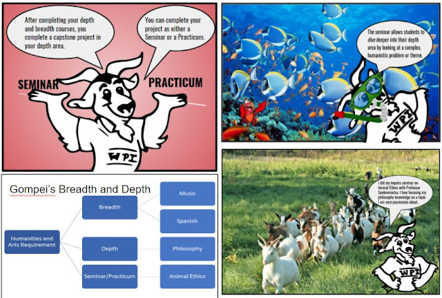
After some discussion, Caroline and I decided to target incoming first year students who are trying to learn more about their options for the Humanities and Arts Requirement. Our audience, as previously mentioned, are first year students with the purpose being to educate them about the Breadth and Depth option of the Humanities and Arts Requirement.
We decided to have Gompei be the main character of our comic strip, as he creates ethos with the reader. We were trying to style him into a tour guide, but we are not sure if we were completely successful with this goal. Caroline and I figured that many of the incoming first year students at WPI had taken a tour, which likely was their first introduction to the WPI community. Even if they had not taken a tour at WPI, we figured that they had been on at least one college tour during their search, thus they would be familiar with this type of layout and lingo. We are pondering changing the name to “A Tour of the Humanities and Arts Requirement: The Breadth and Depth Components”, but we are not sure if our comic really conveys that they are going on a tour.
We decided to impose cartoon pictures of Gompei on real life scenes to attempt to humanize the comic and create more shared ethos between the characters. The interviews at the end of the comic give testimonials to the strength of the program as well as a means of persuasion for the incoming students to decide on the breadth and depth route.
Things to improve:
- If we are planning on the tour route, we need to make this a stronger theme throughout the comic.
- The WPI logo is backwards on Gompei on one of the frames.
- There are slides with blank spaces that currently look a little odd.
- Possibly providing an example schedule with courses to drive home the point.


The chart screenshot has a red-squiggly spellcheck line in it! eek!
ReplyDeleteI really like your hand-drawn Gompei character. Gompei's head on the person standing at the podium is hilarious for some reason--please keep that. Overall, your comic looks very good. I like the use of hand-drawn Gompei on top of real photographs. The red gradient background is meh--it's fine, not particularly bad, but I'm also not particularly fond of it. I think that choosing red is appropriate to fit with your WPI/Gompei theme.
Some of the text bubbles look awkward with a block of left-aligned text in a round bubble. As Professor deWinter mentioned in class to another group, you should center the text.
Good catch on the spell check squiggle that carried over to the screenshot! Caroline and I fixed it in our final version.
DeleteI definitely like the approach of using Gompei as a tour guide, and I agree it should be an immediately relatable figure and presentation format to new freshman.
ReplyDeleteThe visual of an unbalanced scale to compare the depth and breadth sides of the requirement works very well to help convey the difference between them. It might be even more effective if the breadth had a more clearly different font to hammer home that the courses are on different topics, but what you have works well enough.
While I do like the contrast provided by periodically using the red-white gradient panels, I do think they are too common in this draft so I'm glad you changed those later on.